A room can be beautifully furnished and still feel tiring. The sofa is comfortable, the artwork means something, and yet your eye finds no place to rest. That is often visual clutter: not too many things, but too many elements asking for attention at once. A well-planned interior gives your daily life a calmer backdrop, with space for what really deserves attention.
What causes visual clutter in an interior?
Visual clutter happens when the eye receives more information than it can comfortably organise. That can come from sheer quantity, but also from contrast, an awkward layout, unfinished choices or storage that does not match real routines. A room does not have to be minimalist to feel calm. It needs a clear visual hierarchy.
A home with books, collected ceramics, children's drawings and inherited furniture can feel very personal rather than busy. The difference lies in selection, placement and repetition. When every surface, every wall and every corner tries to tell its own story, the whole becomes hard to read.
Too many visible things
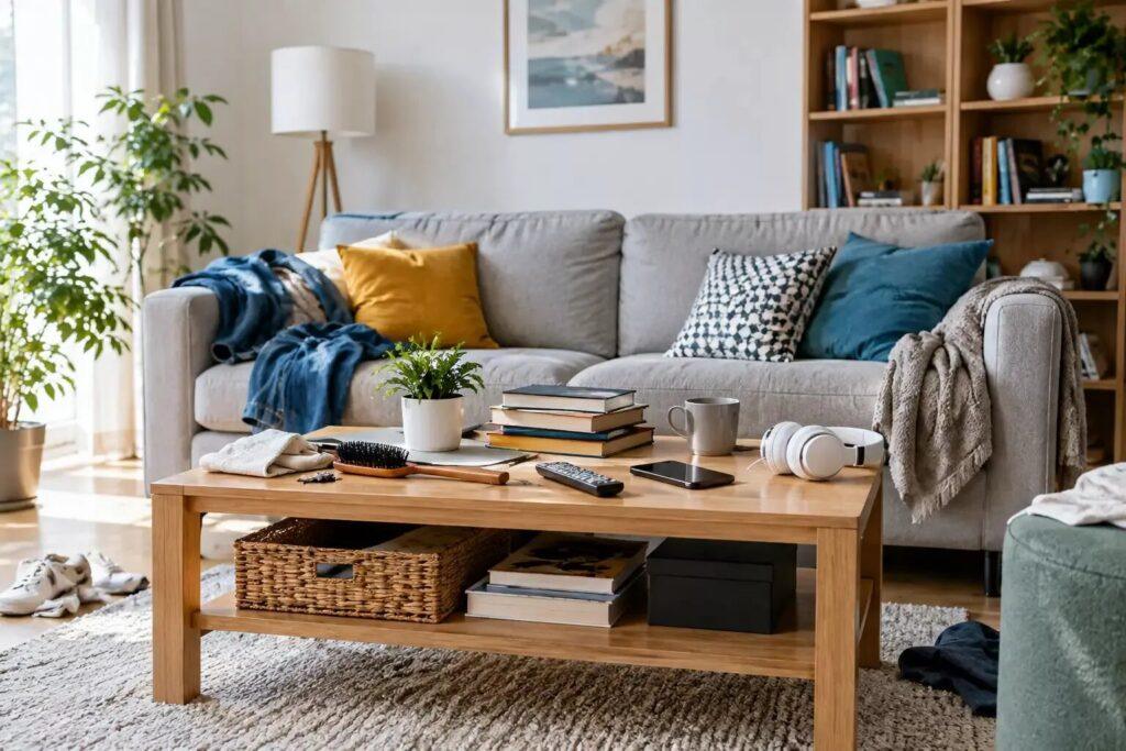
The best-known cause is too many things in sight. Worktops become landing spots for post, chargers, small appliances and the daily shopping. The dining table turns into a temporary desk. Open shelves collect objects that were never meant to be on display.
This has nothing to do with untidiness or a lack of taste. Often it is a sign that the storage plan no longer fits the household. A well-designed room takes into account where bags are dropped, where papers pile up and which things need to stay within reach. When practical storage is missing, everyday items take over the surfaces.
Competing colours, patterns and finishes
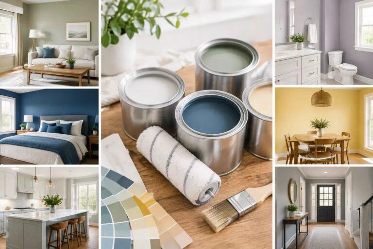
Colour creates atmosphere, but too many unrelated colours can fragment a room. The same goes for strong patterns, glossy finishes and a mix of woods, metals and textiles without a common thread. Each item can be beautiful on its own; together they ask the eye to make too many choices.
A calmer concept does not have to mean beige or bare. It can include rich colour, graphic art or an expressive rug, as long as other elements support that focal point rather than compete with it. Repeated tones and materials create continuity between the zones of a room and give the interior a sense of intention.
Furniture that interrupts the flow
Visual busyness also comes from the way furniture takes up space. An oversized sofa, several small side tables or a chair where you should be able to walk can make even a spacious room feel cramped. When furniture blocks a walkway, the body notices before the mind does.
Good flow means you can move through the home naturally: open a cupboard without manoeuvring around a side table, walk through the hall without brushing past piles, sit down without first moving several things. Empty space is part of the design. It gives furniture presence and makes the room feel more generous.
Unclear focal points
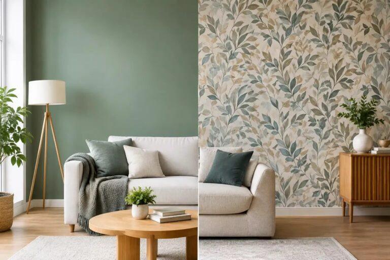
Every room benefits from a resting point for the eye. That can be a fireplace, a view, an artwork, a sculptural lamp or a beautifully laid dining table. Visual clutter appears when several elements want to be equally important: a wallpapered feature wall, a crowded gallery wall, a striking rug, dramatic curtains and heavily styled shelves in one line of sight.
The answer is rarely to remove personality. Instead, decide what the room should say first. Once that focal point is clear, the surrounding choices can be calmer, more restrained or simply better organised.
The subtle sources that are often overlooked
Some of the most disruptive clutter is small, repeated and easy to ignore. Cables, remote controls, visible cleaning products, mismatched containers and half-empty packaging can undermine an otherwise refined room. The same goes for too many cushions, artificial flowers that have lost their purpose, or a collection of small decorative items spread thinly over every surface.
Lighting deserves the same attention. A room with several mismatched lamps, exposed bulbs with different colour temperatures or harsh ceiling light can feel restless, even when everything is tidy. Layered lighting works best when it matches how the room is used: brighter where tasks are done, softer where people rest, and carefully chosen to highlight the best qualities of the room.
Walls can become visually crowded too. Art has more impact when it is given enough breathing room. Rather than filling every empty stretch of wall, look at scale, alignment and the relationship between the pieces. One substantial artwork can add more character than six small items hung without a shared rhythm.
Why visual clutter can feel emotionally heavy
Our home is the canvas for daily life. When the visual surroundings feel chaotic, the mind has fewer places to pause. For some people that shows up as a mild, lingering irritation. For others, especially in busy households or demanding working weeks, it can add to a persistent feeling of unfinished business.
That does not mean a calm interior has to be sterile. A home that is too tightly organised can feel impersonal, especially when children, pets or creative work are part of the household. The goal is not perfection, but surroundings that can carry real life with ease.
In commercial spaces the effect is just as big. A reception full of notices, mismatched furniture and excessive branding can make a business seem unsure of its identity. A well-edited space, on the other hand, shows care before a word is spoken. It helps visitors find their way and lets the character of a brand come through with confidence.
How to reduce visual clutter without losing character
Start by observing rather than immediately buying storage or replacing furniture. Stand at the entrance of each room and notice where your eye goes first. Then ask yourself whether your attention should go there. A photo of the room can help, because the image often reveals visual noise that has become invisible through habit.
Next, distinguish between useful, meaningful and purely decorative objects. Useful things need a reachable place. Meaningful objects deserve a considered display. Decorative items have to earn their place by adding colour, texture, scale or emotion. If an object does none of that, it is better stored elsewhere, passed on or removed.
It also helps to work in visual zones. Keep the mantelpiece, coffee table or dining table deliberately simple, rather than expecting every surface to carry decoration. Group smaller objects instead of spreading them around the room. A carefully composed arrangement gives treasured pieces more presence and makes cleaning easier too.
Choose storage based on behaviour, not wishful thinking. Open shelves suit things you like to see and can keep in order with a little discipline. Closed cupboards are often more forgiving for technology, paperwork, toys and the practical necessities of daily life. The right balance depends on your routines, the architecture of the home and how much visual calm you need.
Finally, try not to solve clutter only with more boxes and baskets. They can be useful, but they become an extra layer of visual activity when every room is full of them. Choose a smaller number of well-proportioned storage solutions that fit the wider material palette and really make use easier.
A more conscious way of looking at your home
Reducing visual clutter does not mean polishing away the traces of a life well lived. It is about giving that life a more graceful setting. A favourite chair, a shelf full of books, a child's painting or a holiday souvenir can all belong, as long as the room has a coherent frame around them.
At NederVal Design & Comfort the starting point is always the person who uses the room: routines, memories, ambitions and need for comfort. From there, an interior can be shaped with enough order to feel restorative and enough character to be unmistakably yours.
Before you change everything, choose one surface or one line of sight to refine. Clear it, keep what matters and notice how the room responds. A more harmonious home often starts with that small moment of space.