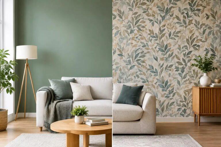
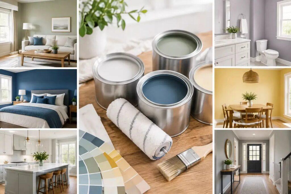
A wall colour can be exactly right and still feel wrong once the paint is dry. Often the problem is not the shade but the finish: a surface that catches too much light or shows every flaw. Choosing the best finish is about understanding how a room is used and lit. That way paint sets not only colour, but also rhythm and calm in your home.
What a paint finish actually changes
A paint finish refers to the sheen level: the amount of light the dried surface reflects. At one extreme is a matt finish with little sheen, soft and absorbent in appearance. At the other is high gloss, which reflects a lot of light and creates a sharper, more formal effect. In between are finishes such as eggshell, satin and soft sheen.
Sheen affects more than style. The higher the sheen, the more washable and hard-wearing the paint usually is, but also the more it draws attention to dents, joints and uneven walls. Paint with less sheen is more forgiving and has a beautiful calm, especially in rooms with soft daylight. The downside is that not every standard matt paint copes equally well with fingerprints, steam or regular cleaning.
The right choice is rarely about one finish for every surface. A home feels more finished when walls, woodwork, ceilings and cabinets each have a finish that suits their role, while still belonging to the same visual story.
The best paint finishes per room
Living room: durable matt for softness and ease
For living rooms, a durable matt wall paint is usually the most considered starting point. It has the velvety, low-reflective quality that makes colour feel rich and architectural rather than shiny. This works especially well on wide walls, where a calm finish lets art, textiles and furniture take their place without visual competition.
Choose a washable or scrubbable matt paint if the room is used daily by children, pets or frequent visitors. Not every matt paint performs the same, so the specification matters. A traditional ultra-matt paint may offer exceptional colour depth, but a modern durable matt is often the better practical choice for a busy family room.
In a north-facing room, do not simply assume that sheen will solve a lack of light. A slightly glossier finish can brighten a wall, but it also exposes imperfections. It is often more effective to refine the colour, lighting and furnishings and still choose the softness of matt paint.
Bedroom: matt walls and a calm ceiling
Bedrooms benefit from finishes that soften the room rather than enliven it. Matt paint on the walls creates a restful backdrop, especially in muted mineral tones, warm neutrals and deep, enveloping colours. It absorbs light rather than bouncing it back, which makes the room feel calmer in the evening.
For ceilings, a flat matt ceiling paint is the natural complement. A ceiling should usually stay in the background of the composition, not glint under the bedside lamp. Painting walls, skirting and sometimes the ceiling in closely related shades can create an enveloping effect in a compact bedroom. The difference in sheen, rather than a dramatic colour difference, can still subtly distinguish each surface.
Hallway and staircase: washable matt with resilience
A hallway is the working zone of the home. Coats rub against the wall, bags leave marks, hands touch the banister and the daylight changes through the day. This is where a durable, washable matt paint earns its place. It keeps a refined, low-sheen look and still copes better with daily life than a delicate decorative wall paint.
Woodwork can be painted in eggshell or satin, depending on the effect you want. Eggshell has a restrained, almost chalky sheen that suits both classic details and considered contemporary interiors. Satin is slightly more reflective and especially practical on banisters, doors and skirting boards that are touched often.
If the hallway has uneven plaster, avoid high gloss. Good preparation is essential, but a lower-sheen wall paint remains more flattering. Raking light on a stair wall can reveal much more than you would expect.
Kitchen: a finish for cleaning, not just shine
Kitchens call for durability, but they do not have to look clinical. For walls outside the direct splash zone, a quality washable matt or a kitchen-specific matt finish can give a polished result. Around hobs, sinks and worktops the surface needs extra attention. A splashback of tiles, natural stone or glass is usually more suitable than paint that constantly has to withstand water, grease and heat.
For kitchen cabinets, eggshell is an elegant choice with a soft, furniture-like character. Satin is more resistant to wear and easier to wipe, which makes it a sensible choice for active households, although the extra sheen gives a more contemporary, polished look. High gloss is very durable but visually outspoken. It works best when used deliberately, for example on one sculptural kitchen island or finely detailed joinery, rather than as a default choice.
Bathroom and utility room: moisture changes the brief
Bathrooms need paint that can withstand condensation and regular cleaning. Use a bathroom-specific paint on walls and ceilings, especially where ventilation is limited. These paints resist moisture and mould better than standard wall paint, but they do not replace a good extractor fan or air circulation.
A soft sheen can be practical here, although many modern bathroom paints now offer a restrained matt look. That way the room keeps the calm of a spa-like interior without sacrificing performance. As in the kitchen, paint should not be used in places that are in constant direct contact with water.
Doors, skirting and mouldings: the final finish
Woodwork is where the paint concept becomes tangible. Doors, frames, skirting boards and window mouldings frame the movement through the home, so their finish should feel deliberate. Eggshell is often the most versatile choice: durable, restrained and refined, in both classic and modern interiors. It works especially well when walls and woodwork are painted in the same colour, creating subtle tonal layers instead of a hard outline.
Satin suits homes that need extra resilience or speak a crisper, contemporary language. Full gloss also has its place, especially in historic interiors or on carefully prepared statement woodwork, but it demands excellent preparation. The reflection shows every detail, including the ones you would rather have kept hidden.
Light, texture and preparation matter as much as sheen
Paint is experienced through light. The same finish can look almost powdery in soft northern daylight and noticeably reflective under warm evening lamps. Paint generous test patches before you decide and move them around the room at different times of day. Looking at a small test sample next to a window is not enough to understand how a finish will behave across a whole wall.
The condition of the surface also deserves a place in the decision. High-gloss paint magnifies flaws, while matt paint disguises small irregularities but can be harder to touch up if the original batch or application method differs. With freshly plastered walls, allow enough drying time and use the right mist coat or primer. With previously painted surfaces, cleaning, sanding and repairing are not glamorous steps, but they are what makes a refined finish actually look refined.
Look at the paint system as a whole. Primer, undercoat and topcoat have to suit the surface and work together. This is especially relevant for wood, metal radiators, kitchen cabinets and surfaces that have been painted many times before.
Creating coherence without making everything identical
A carefully designed home does not need a uniform sheen level from the front door to the attic room. In fact, a slight variation can make the interior easier to read. Matt walls form the calm field of colour; eggshell adds a soft accent on woodwork; a specialist durable finish supports rooms that work harder.
The key is restraint. A collection of unrelated finishes can make a room feel busy, even with a simple colour palette. Choose a small family of finishes that suits the character of the home and repeat them with purpose. With a complete interior concept, this conversation starts early, together with floors, window treatments, lighting and the practical patterns of daily life. That way a colour palette becomes a setting instead of a series of separate choices.
At NederVal Design & Comfort the choice of finish is treated as part of how the home is experienced: how the morning light falls through the hallway, how easily a kitchen wall wipes clean, the softness a bedroom needs at the end of the day. Let paint do more than cover a surface. Let it support how you want to feel at home.